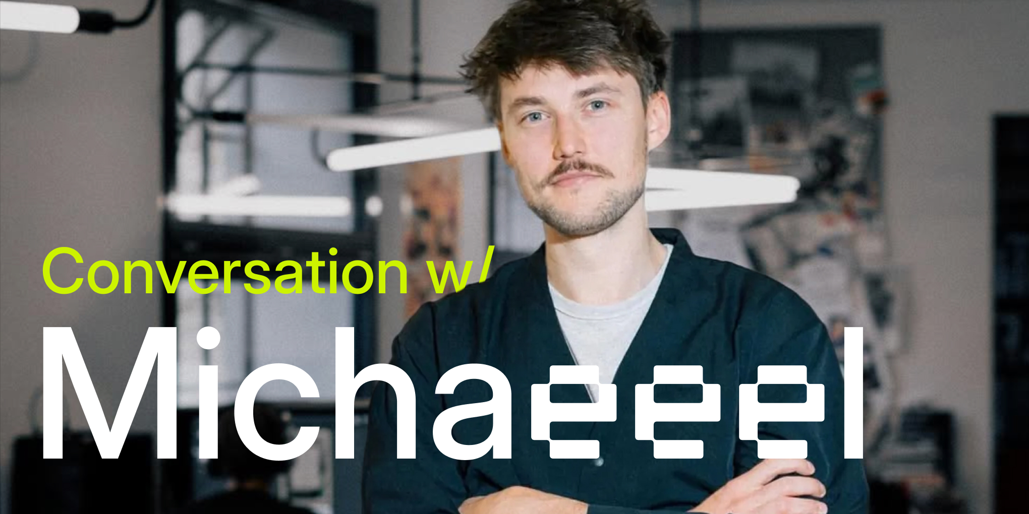
Inside the Mockuuups Rebrand: A Conversation with Michael Dolejš
- Behind the Scenes,
- 8 minutes to read
Studio Najbrt designer Michael Dolejš shares insights on rebranding Mockuuups mockup platform: creating custom typography, building a scalable brand system for device and print mockups, and why implementation matters more than presentations.
This interview complements our rebrand story, told from David and Marek's perspective.
Key Takeaways
In this interview, Michael Dolejš shares:
- How the "lucky accident" led to the custom typography system
- Why the signal pattern metaphor works for mockup placeholders
- The challenge of designing for both digital and print mockups
- Why implementation matters more than presentation slides
- Advice for companies considering a rebrand
Introduction
Michael Dolejš is a graphic designer and partner at Studio Najbrt. He specializes in identities, user interface design, communication and strategy.
In this conversation, Michael shares insights on creating a comprehensive brand system for Mockuuups, from custom typography to scalable placeholders.
Getting Started
How did this project come to you?
I've known David and Marek for about 10 years. I've been a fan of Mockuuups since the Dribbble days and always admired how thoughtfully they created and cared about their product.
We reconnected after few years, and they asked if I was interested in helping push Mockuuups to its next stage. The main challenge was creating a visual brand system that would help their mockup generator stand out in a sea of competition, while supporting expansion from device mockups (iPhones, tablets) into print mockup scenes (billboards, posters).
Development of Mockuuups branding over the years

What were your first impressions of the challenge?
I was excited to bring this to Studio Najbrt because the challenge was different from anything we'd done before. I wasn't sure how to tackle everything David and Marek wanted to solve, but after thinking about it I started seeing ways to build a new visual system around their goals.
What made rebranding a mockup platform unique?
The thing that surprised me most was how competitive the mockup generator field is. It takes exceptional hard work to be successful, which Marek and David definitely put in. The competition never sleeps, so our solution had to be quite distinctive. Something no one else could claim.
The Creative Approach
Where did you start?
As with every branding project, it starts with a brief. Luckily, David and Marek knew what they wanted and understood the challenge, so it was straightforward.
Personally, the most important thing is to just sit down and start with something. Sometimes this can take me in directions that maybe don't make sense, but after some time you come up with a few concepts that I further discussed with my colleagues, which always helps push things further.
We presented 3 different directions, which later evolved into what we see today, but during the process we came up with way more than that.
Any surprising discoveries or pivots during the process?
Looking back at old files, it's funny to see how the final result is actually a combination of all 3 versions we presented, yet it doesn't feel frankensteined together.
I'm grateful to David and Marek for being remarkable clients. They looked at the presented directions calmly and respectfully, clearly communicating what they liked and didn't. Being suddenly a client when you're used to being the problem solver is fascinating, and I think they handled it great.
This meant no U-turns in the project, just thoughtful discussions that got us to a finish we were all happy with.
What were the key "aha" moments?
One of the most decisive moments was the observation to lean into the typographical stylization of the three letters in "Mockuuups." What if we applied this to other mockup types: T-shiiirt, Compuuuter?
This could replace the traditional symbol or logo the project had before. It led us to a custom typeface solution based on Inter font by Rasmus Andersson, where we modified all vowels to have a pixelated look so the triple-letter pattern was more pronounced.
Another key area I pushed from the beginning was emphasis on being colorful. Every competitor tried to be as minimalistic as possible, so we thought it would help Mockuuups stand out. The acid yellowish green became the primary color. Very different from anything out there.
Acid green in the real world - the distinctive color that sets Mockuuups apart

How did you think about digital and print from day one?
There shouldn't be a difference between them. Whatever we made work on screens should work on paper, business cards, and posters. This became tricky as we tackled different materials like glass and metal, but I think we made it all work cohesively.
Deep Dive: Specific Elements
Walk us through the logotype evolution.
When Marek and David contacted me, Mockuuups' identity was respectable. The logo had an "M" symbol with text, with thoughtful details on website hover and desktop app icons.
We tried replacing this with different icons and typefaces. They looked good, but as placeholder concepts evolved, they didn't fit the purpose. We decided to remove the symbol.
This meant finding a new symbol for profile photos and places where the full Mockuuups text would be too long. The bet on triple "U" on green background works well, even though it was a little risky.
How did the typography/UUU system develop?
As often happens, it was a lucky accident. I was preparing slides for colleagues and wanted to highlight how different triple vowels would look in different words. That was it.

From there, we developed it into the custom solution. This involved deep typographical skills from my colleagues Jakub Spurný and Marek Pistora, who created a system that changes vowels whenever you type three identical letters.
Later we added stylistic sets so it works seamlessly on the website without messing with SEO. I'm very happy with what we accomplished.
What was the biggest challenge with the placeholder system?
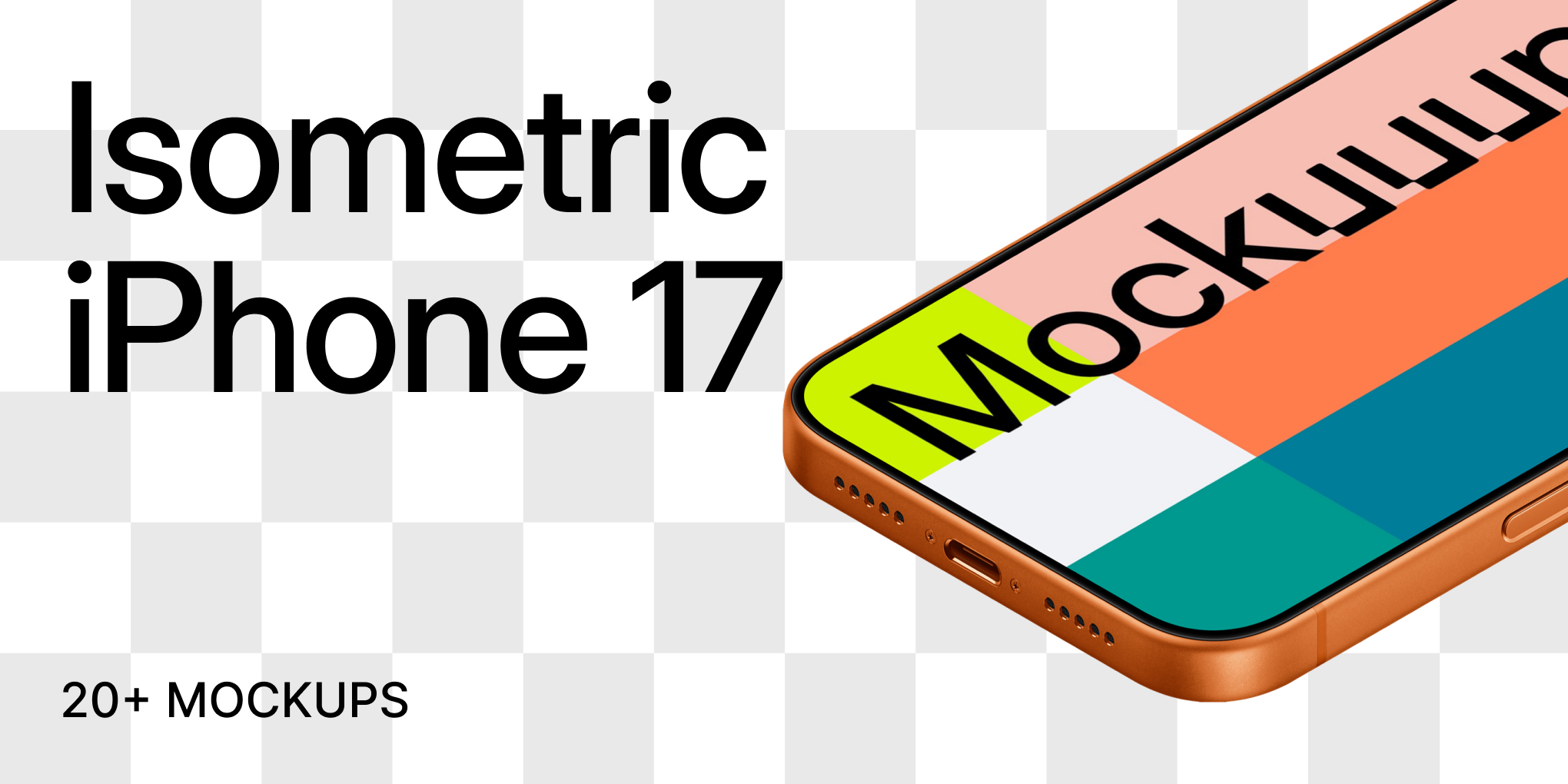
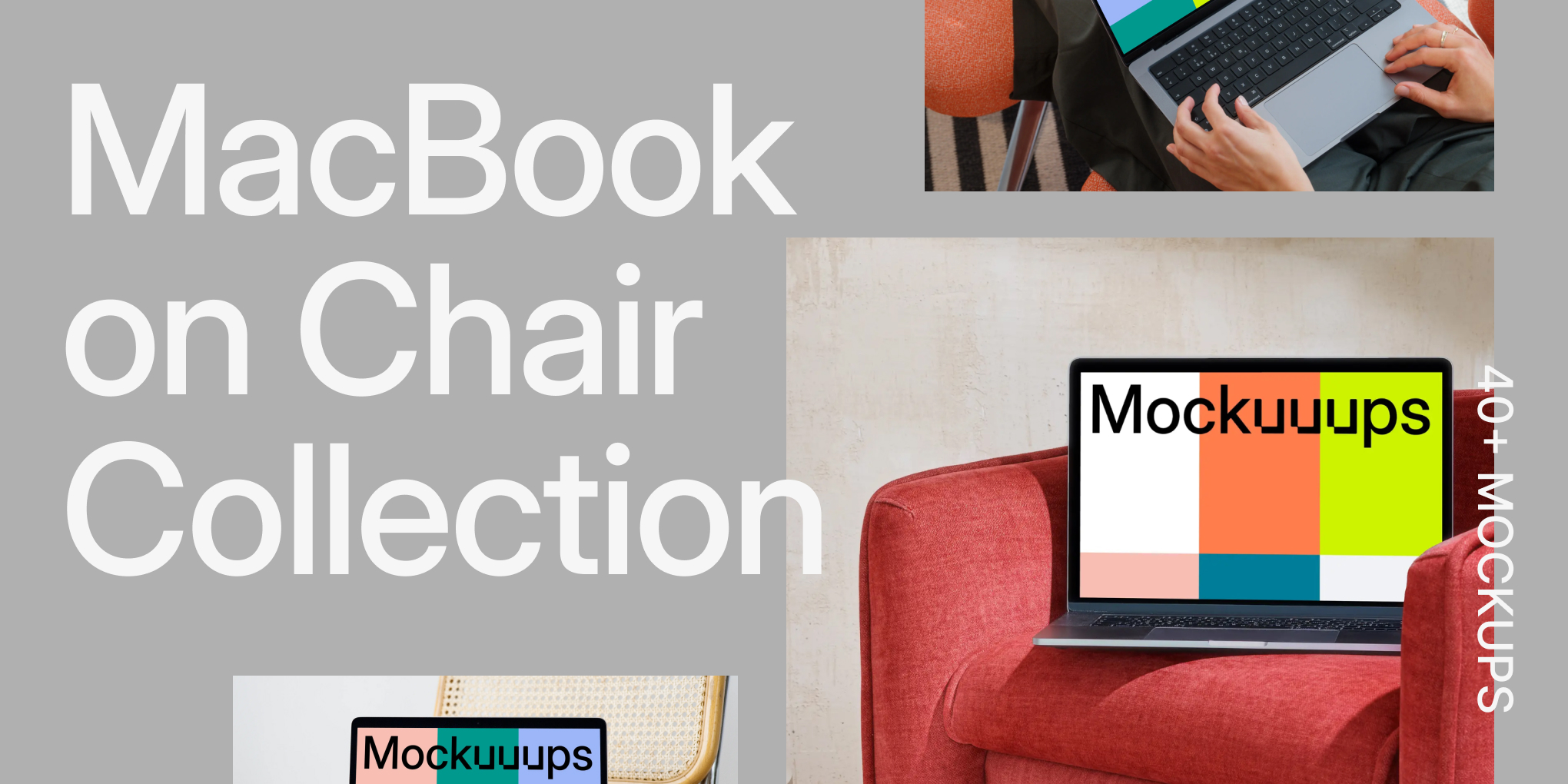
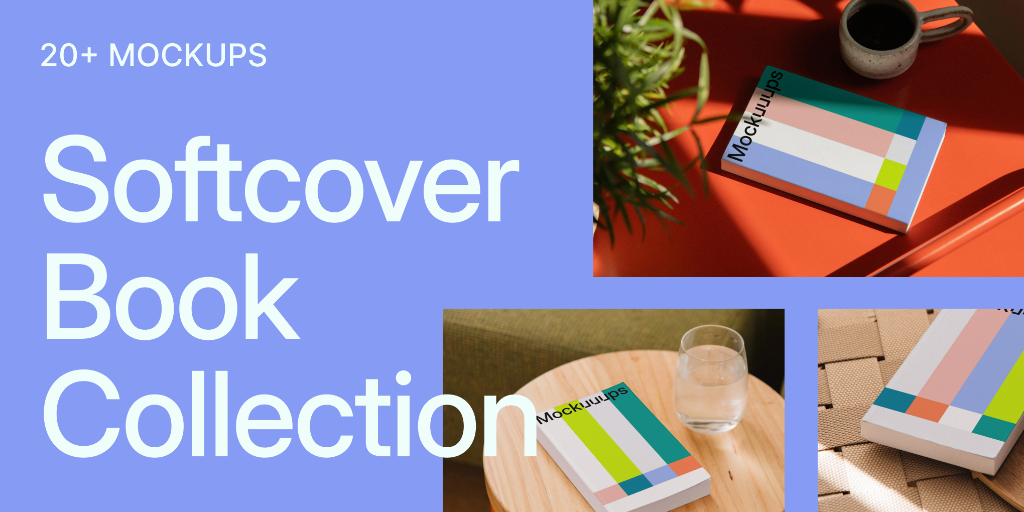
Because of all the new mockup categories planned (from phone mockups to poster mockups), we needed a solution that would work anywhere without looking stale or boring. We placed big emphasis on modularity. The system needed to work across different ratios and placeholder types while staying consistent through color and composition.
The final version played with the idea of signal stripes from television when reception is lost. We thought this was a great metaphor for mockups. They're empty until you drag your design into them.
Combined with our main green and four supporting colors, it created a vibrant, recognizable palette that works in simple three-column layouts or sophisticated multi-row versions. The final touch was integrating the custom typeface to describe what users see.
How do you approach motion for brand identity?
Having a distinctive animation layer is important for any modern brand. We divided motion design into two parts.
First, we played with simple solutions. Animating signal patterns into different colors and shapes. Mockuuups coded their own tool for generating pattern variations, which helped create many versions easily.
The second part came about a year later. We built on the baseline, expanding to typography and promotional strategy (how-to videos, website). This led to more definitions of how motion should feel and interact with new elements like pictograms.
Any rejected directions worth sharing?
Not really, but of course the process is never straightforward, so we did find some limits when developing everything. It all became part of the final result. I still like one idea originally created for a Karlovy Vary IFF poster that played with different movie formats overlaid on each other. In hindsight it wasn't better than what was selected, so maybe I can use it for something in the future.
The Designer's Perspective
What are you most proud of in this identity?
That we were able to find a visual language that's unique to the category and will hopefully help Mockuuups be successful and visible for many years to come.
Designing for design tools. Any meta considerations?
It could be very different designing for end users versus designers. We professionals have different ways of working and get angry if changes mess up our workflow. But I don't think it made much difference in this project. We haven't changed how the product works in any meaningful way, only made it more cohesive and beautiful.

What detail do you hope people notice?
The typography. It's very sophisticated yet based on a very simple concept.
How do you think about longevity versus trends?
Nothing wrong with playing the game with trends and looking up to date, but trends are here to be set, not followed.
Advice & Reflections
Advice for companies considering rebrands?
Don't be afraid of change. Work with someone you like who knows what they're doing.
What makes a rebrand successful versus just different?
Implementation is king. No one cares how it looked in your presentation. All that matters is how it works in real life. That goes for websites, apps, and branding.
Logo micro-interaction on the Mockuuups website
Anything you'd do differently?
No, I'm quite confident on this one!
Looking Forward
What are you excited to see as Mockuuups grows?
More mockups, so I can proudly use them in my presentations. And of course, how they'll adapt their approach with ever-present AI in our industry, which I'm sure they'll handle with ease.
How do you think the system will evolve?
You never know, but things happen. I'm sure they'll do their best with it.
Follow Michael's Work
Instagram: @michaeldolejscom
Read our perspective on the rebrand and see the system in action.
What's Mockuuups Studio?