How to chose the right mockup
- Tips & Tricks,
- 3 minutes to read
It looks like every mockup are similar. Sometimes biggest difference is the position of the hand and the phone or laptop you’re holding. Of course, there are several other things which are very important. It’s how the hand looks like and the background. Ugly looking hand or very colorful background can be very distracting or even unattractive.
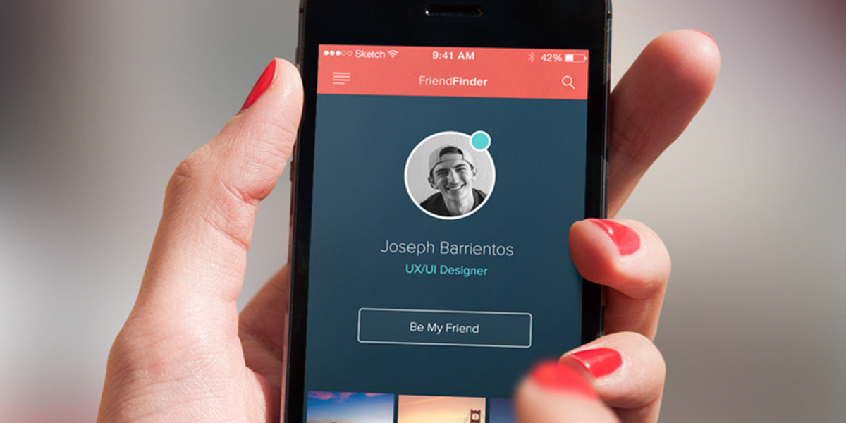
*But how to choose the best mockup for your project? It’s pretty easy, but you need to follow several steps. *
1. Background
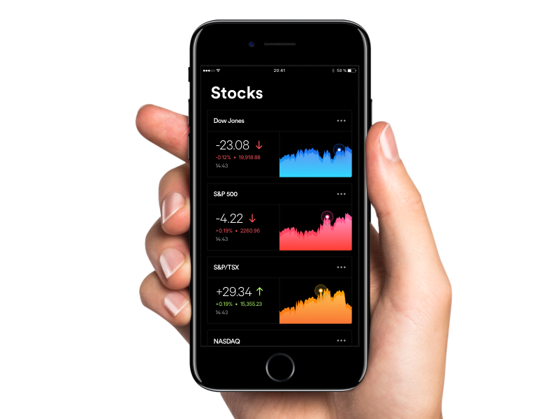
Let’s start with the background. Most of the time, neutral background works the best. If you are using a mockup like the example below, it’s a great choose. Because this mockup can be used in almost every design or landing page, and it’s easy to focus only on the product.
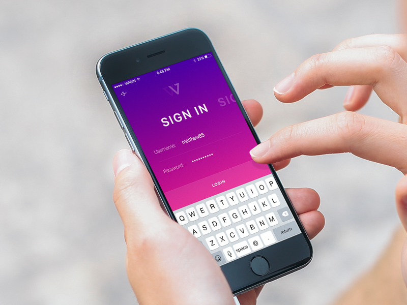 Sign In Screen by Ionut Zamfir
If we’re talking about backgrounds, there is another choice. If your product is application and design of it is light (white, yellow or cream colour) is better to choose colorful and “noisy” background. Because your product must be the main factor in the picture. By the colour psychology people first see darkest or whitest areas of the picture.
Here is great example.
2. Hand & Nails
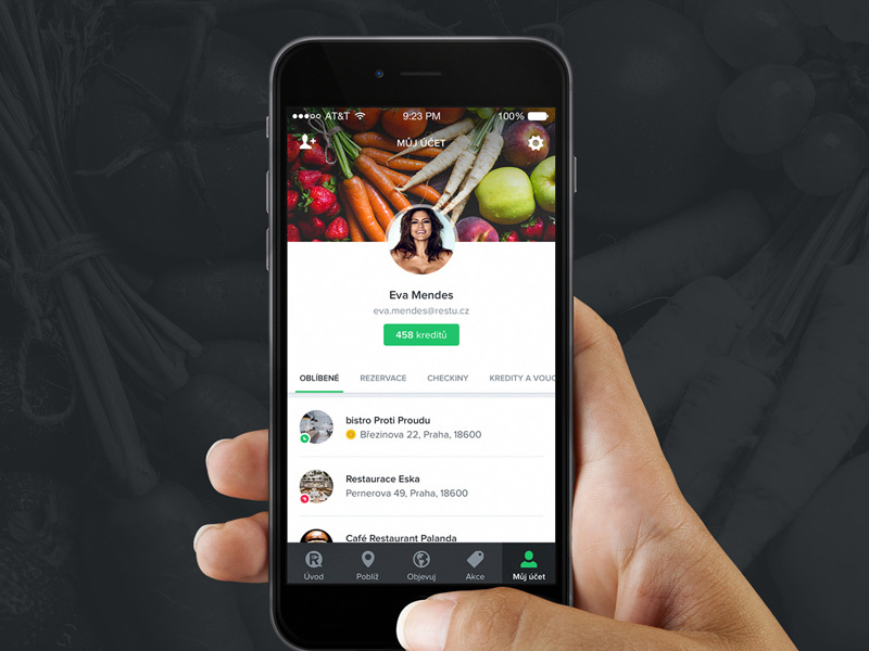
Another very important thing is hand and nails. A lot of designers and product managers will tell you, that nails with the colour is bad. Because it distracts the users, which come to see your product and he will remember only nails. But, if your website or product is for women, it could be a great part of the marketing. She will imagine how she’s using your product or reading your websites. Sometimes it’s good to be different, it means you’re unique.
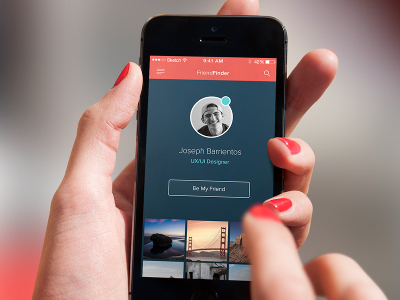 FriendFinder by Joseph A Barrientos
3. Hands gestures
Hand gesture is another important part of the mockups. If you are selling new typing or keyboard app, mockup must match the product. It will be very strange if there is a picture of the keyboard and the hand or finger is sliding. Be careful with the gestures.

4. Please no iPhone case or sticker :)
The last and my personal advice is to use mockups where you are able to see full phone or laptop. For me, it’s more attractive than the sectioned phone and you can guess the model easily. And don’t use any cases or stickers on the phone, cause sometimes it could be more interesting than your product.
In the end, I want to show you bad example of colours used in this mockup. Everything is fine with the mockup, hand and nails are nice, but the colours of the apps and the background are the same. It’s very distracting. I know sometimes it’s hard to make it different colours , especially if your product is photo app, but you need to find the way.
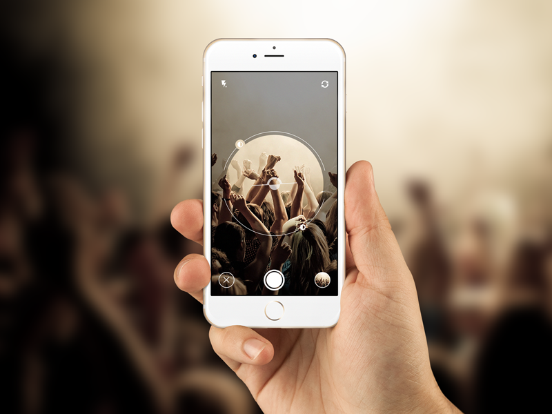 Super Secret App by Peter Main
I hope you got inspired and will use this advices in your next projects. We'll be more then happy to see results of your work, so don't hesitate and put it in comment below or hit us with email :)
