


![Best Bento Grid Design Examples [2024]](https://assets.mockuuups.com/mo/image/upload/w_0.5/hy81ajhubqkkpxco8jpr)
As we dive deeper into 2024, the bento grid continues to dominate the UI/UX design landscape with its clean lines and structured elegance. This Japanese-inspired layout, reminiscent of the orderly compartments of a bento box, offers a unique approach to organizing content in a visually appealing and user-friendly manner. Today, we'll explore some of the best bento grid examples that have set the bar for functionality and aesthetics this year.
Jump to:
- What's Bento Grid in UI/UX Design?
- Why Choose a Bento Grid?
- Best Bento Grid Examples in 2024
- Conclusion
What's Bento Grid in UI/UX Design?
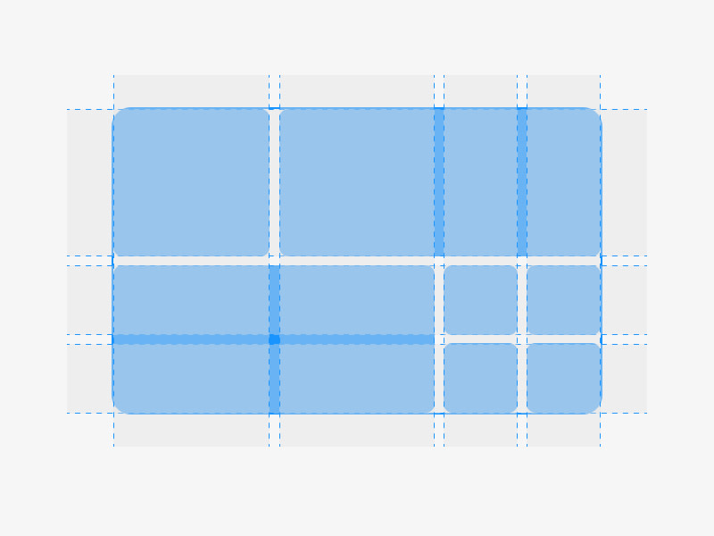
When browsing the internet, chances are you've seen this kind of design. Known as a bento grid layout, bento box layout, or simply a bento box grid, it's modeled after the classic Japanese bento box.
Bento grids in UI/UX design are incredibly adaptable and are excellent for showing off a variety of content—whether that's images, text, or a mix of different media. They present a wealth of information in a neat and orderly fashion, giving your website or app a tidy and attractive look.
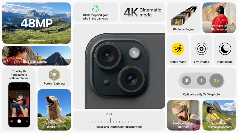
It's often thought that the bento grid trend was influenced by Apple's promotional videos, where they display a grid featuring the specifications and features of their products. They found a way to make what are usually dull spec lists visually appealing by organizing them in a grid with a mix of visuals and typography. An example of this can be seen in a screenshot from a recent Apple Mac promotional video.
 Origins of Bento Grids in UI/UX design?
Yet, there are those who believe the real roots of this design trend might trace back to Microsoft's introduction of the Metro design language with Windows Phone 7. Regardless of who originally inspired it, this style has certainly ignited the creativity of designers worldwide, leading to a surge in bento box-style designs.
Why Choose a Bento Grid?
Minimalism in Bento Grid Designs
Minimalism isn't just an artistic choice; it's a design philosophy that puts the content front and center. In the realm of UI/UX, it strips away the superfluous to reveal the essence of a product. When applied to bento grid layouts, minimalism creates a clean, distraction-free environment that not only looks good but also improves user experience.
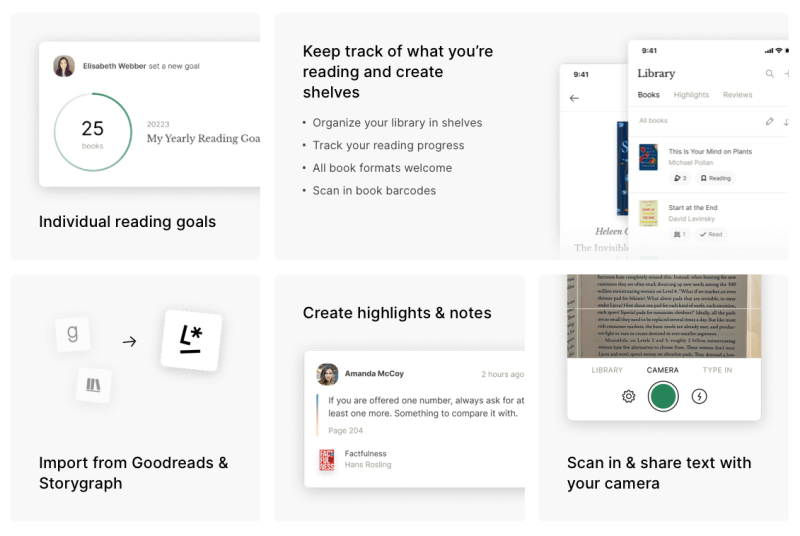
Imagine landing on a website that's like a breath of fresh air—this is what Literal achieves. Through its meticulous bento grid design, Literal presents content in a well-organized and easily navigable manner. The strength of this minimalism lies in its strategic features: bold typography stands out against a muted color scheme, each section defined by generous amounts of whitespace.
Enhancing User Interaction with Bento Grids
Interactive elements in UI design are valuable because they help to create an engaging and intuitive experience for users. By incorporating elements like buttons, sliders, or device mockups, designers can guide users through a website or app seamlessly. Interactions make a digital platform feel more alive and responsive, enhancing the user's journey and making the experience memorable and enjoyable.
Interactive Bento Grid by Create.videoThe Create.video website shows us how fun and easy it can be to use a site with a bento grid. Instead of just looking at pictures and text, users can move their mouse over different parts to see cool animations and effects. This makes people want to click and see more, and it makes visiting the website a fun experience. By adding these simple touches, Create.video makes sure that everyone who comes to the site has a good time and remembers it. This shows that even with a simple grid design, you can still have an interactive and enjoyable website.
The Effective Use of Bento Grid Layouts in Storytelling
Storytelling through a grid layout can be highly effective due to its organized structure, which helps guide users through a narrative in a clear, logical sequence. By compartmentalizing content, designers can craft a visual path that leads users from one segment to another, much like turning pages in a storybook.
The Apple is a perfect place to see how stories can be told through a grid design. Each square in the grid acts like a page in a book, with pictures and words that take you on a journey from one box to the next. It's like reading a story but on a website. Apple makes sure people have a fun time reading and looking at their website. It's like having a good story in a neat package, where everything is easy to find and nice to look at. This kind of design can make any website stand out and give visitors a reason to come back for more stories.
Necessity of Responsive UI/UX design in 2024
In 2024, responsive design within the bento grid framework is essential. As the variety of devices and screen sizes continues to expand, UI/UX design must adapt seamlessly. A responsive bento grid ensures that the design maintains its integrity, functionality, and aesthetic appeal on any device, providing a consistent and accessible user experience. This adaptability is crucial for reaching a broader audience and staying relevant in the rapidly evolving digital landscape.
Best Bento Grid Examples in 2024
Halcyon Logistics Branding
The grid seamlessly assembles diverse elements: a logo, typography samples, a user notification, and vivid imagery, including a smartphone interface. It exemplifies a clean and organized way for UI/UX designers to display brand assets and interface elements coherently, offering both functionality and visual appeal.
Bento grid used for branding by Halo LabIconwerk
This bento grid layout, displaying an array of professionally designed icons and a tagline emphasizing simplicity and utility. The icons are varied, indicating custom design services, while the central image of a smiling individual may imply client focus and approachability. The accompanying text highlights the use of modern technology and emotional appeal in the design process. This grid is a sleek example for UI/UX designers of how to concisely present visual services and brand messaging.

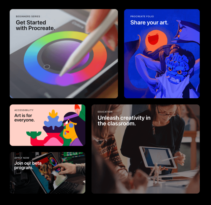
Procreate
Procreate's grid layout with a collection of five distinct content blocks, each housing a unique visual and textual element. The upper two squares highlight art-focused themes, with one inviting users to "Get Started with Procreate" and the other encouraging artists to "Share your art." The layout's balanced, clean lines showcase the functionality of bento grid designs, providing UI/UX designers with a clear, effective way to compartmentalize and display diverse content professionally.
Lottie Lessons by 10xDesigners
This Twitter teasing presents a well-structured promotional material applying the principles of bento grid design. Central to the layout is the word 'Lottie,' prominently displayed, which anchors the surrounding content blocks such as "Mentor Introduction" and "Education Team," each delineated with clear boundaries. The graphic incorporates a mix of playful illustrations and concise text, exemplifying how bento grid layouts can organize complex information into an easily navigable and aesthetically pleasing format.

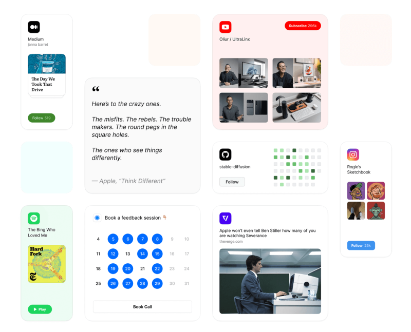
Case Study by Koto Studio
This playful image uses a bento grid to organize various graphical elements, such as text, numbers, and icons, along with real-life imagery. The collection conveys a sense of diversity and creativity, offering UI/UX designers inspiration for integrating different content types cohesively within a grid. It exemplifies how a grid can present information in a fun, accessible manner.

Bento
Bento has gained popularity as a modern "Linktree" style platform, allowing users to craft their personalized web pages. True to its name, it utilizes a grid system to construct content blocks, creatively assembling them into a bento box-style user interface. The flexible design lets users highlight different sections by varying block sizes, making it an innovative and adaptable tool for personal expression.
Conclusion
As we reflect on the evolving landscape of UI/UX design, it's clear that bento grids are more than a passing trend—they are a strategic tool poised to play a significant role in future design frameworks. Their intrinsic structure offers a blend of aesthetic appeal with practical functionality, catering to the user's need for clarity and the designer's desire for creativity. With their adaptable nature, bento grids meet the ever-growing demand for dynamic, responsive designs that function seamlessly across various devices. Looking ahead, we can anticipate that the bento grid will continue to be an influential element in crafting intuitive, engaging digital experiences that resonate with users worldwide.


")


![15+ London Billboard Mockups for Designers [Free & Paid]](https://assets.mockuuups.com/mo/image/upload/c_limit,f_auto,h_300,w_300/lpcpo5vbbiyviubeciuu.jpg)
![Best Apple Device Mockups for 2024 [Free + Paid]](https://assets.mockuuups.com/mo/image/upload/c_limit,f_auto,h_300,w_300/kinjzlkdeykhgx3didhc.jpg)
![10+ New York City Billboard Mockups [Free & Paid]](https://assets.mockuuups.com/mo/image/upload/c_limit,f_auto,h_300,w_300/dg1xmkv4j2w7z5qqr8lb.jpg)

